Fintech case
I worked as a UX/UI Designer on a native trading app in the fintech domain (iOS and Android). The product already existed: there was a powerful web platform and mobile apps with a design system in place, but some UX decisions were outdated and limited growth of key features.
My focus was the mobile experience: core flows, visual improvements, and close collaboration with the dev team. Because of a strict NDA, I keep the client anonymous and only show generalized or anonymized UI examples.

Goal
The main challenge was to make a complex trading product more accessible and to improve business metrics:
Make the app easier for beginners
Simplify onboarding, explain key trading terms in plain language, and guide users through their first steps.
Improve feature discoverability
Redesign a visually attractive but ineffective Copy Trading entry point so users can actually find and use the feature
Strengthen design consistency
Reorganize the design system, remove redundant components, and bring all illustrations and visuals to a single coherent style.

My contribution
1. Making the mobile UX truly native
I brought the existing mobile app closer to native guidelines by aligning key patterns with Apple HIG and Material Design. Within the current design system, I refined how screens and components behave on iOS and Android, and worked closely with the product manager and engineers through live build reviews and design reviews to adapt iOS‑first designs for Android without breaking consistency.
2. Increasing discoverability of a hidden feature
The main entry button to a key trading feature was almost invisible in real use: it looked decorative, was unclear for new users and had a small tap area. I redesigned this entry point to be clearer and easier to tap by increasing the tappable area to follow accessibility guidelines and replacing the vague icon with a clear text label. After the redesign, conversion into this entry point grew 3.6× — from 1.5% to 5.5%.

3. Simplifying the app for users
On the login screen there were four different entry buttons, two of them styled as primary actions, which made new users hesitate. I reduced this to one clear primary action (“Create account”) and one secondary action (“Log in”), removing that decision paralysis.
On the home screen, I made the large banner smaller and reorganized content into widgets for key functions with simple customization, so users can choose what they see first.
I also redesigned how trading terms and market hours are shown, turning raw technical data into clear visual states with explicit statuses and the next important event, so beginners can quickly understand when and how they can trade.

4. Designing gamification and updating the visual layer
The team wanted to use gamification as a way to teach users how trading works. I designed a complete in‑app gamification flow from scratch with streaks, quizzes, market predictions, learn‑and‑earn tasks, avatars and rewards — all focused on helping users learn trading step by step.
In parallel, I brought order to a large existing design system and refreshed outdated illustrations. I used AI tools tuned to the needed visual style to generate new assets and align them, so the app kept its foundations but looked more consistent and up to date.

5. Making help content actually helpful
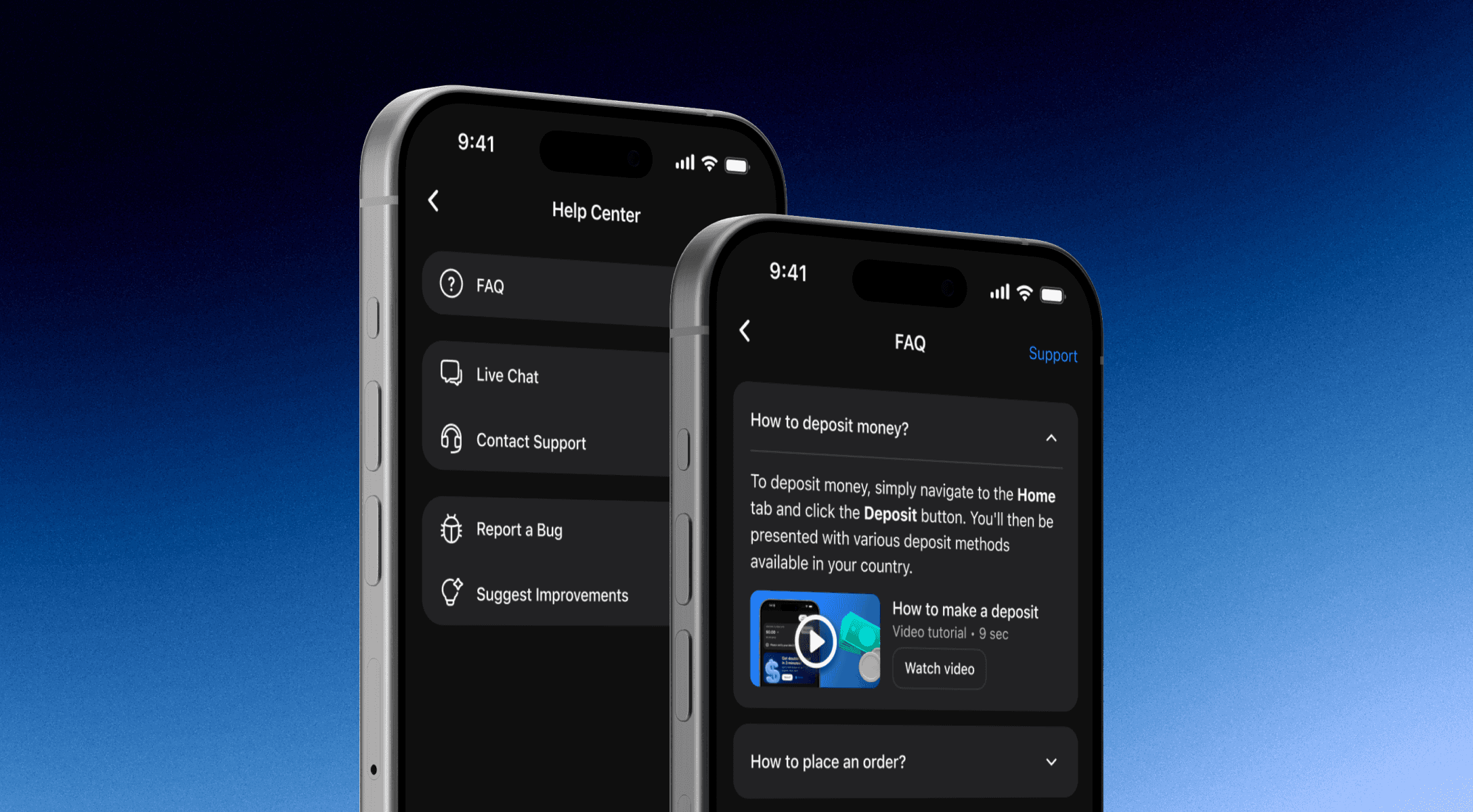
Users kept asking the support team the same basic questions, while existing video tutorials had no clear place inside the app. I created a dedicated FAQ & support section structured around real support topics and filled it with short, focused video tutorials I recorded myself. This gave users a predictable place to find answers and tips, without overloading the main product experience.
Result
Conversion into Copy Trading increased 3.6x — from 1.5% to 5.5% after the redesign of the entry point and flow. The feature successfully scaled to 18k+ monthly active users without losing usability.
The onboarding became clearer, the home screen more adaptable to different user needs, and the team received a structured gamification system and support experience that can grow with the product.


See also: